Escape rooom broshure design
Marketing material that pops
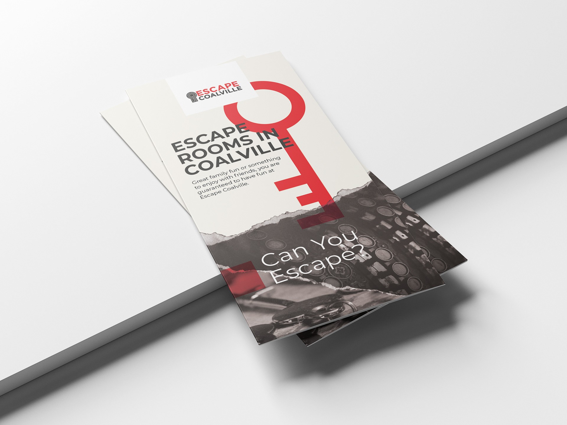
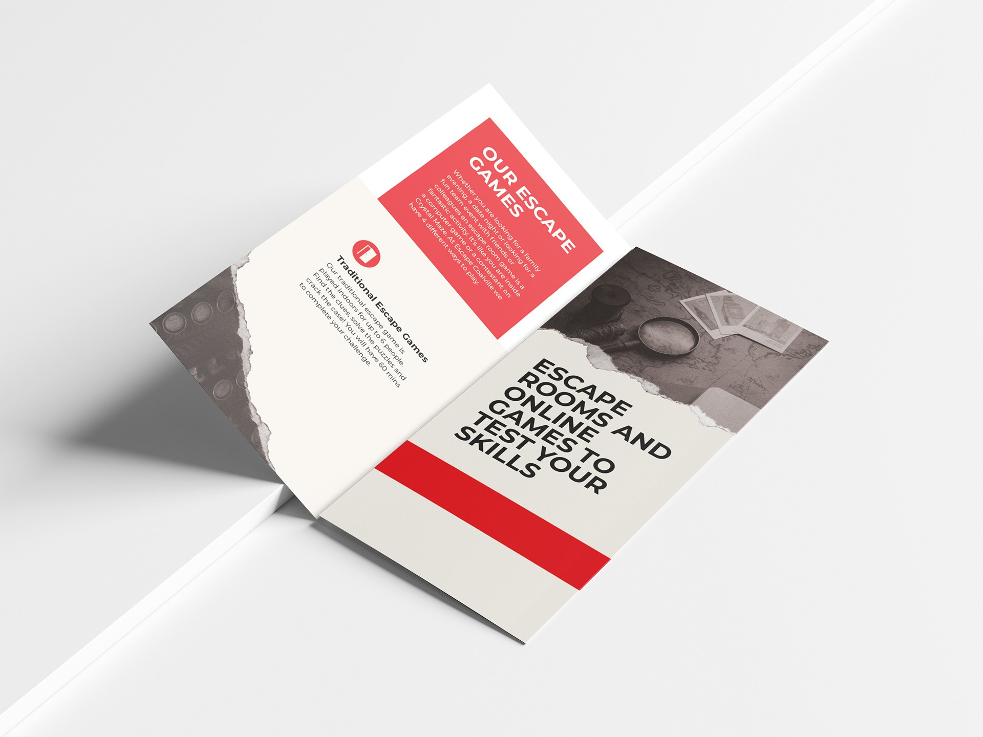
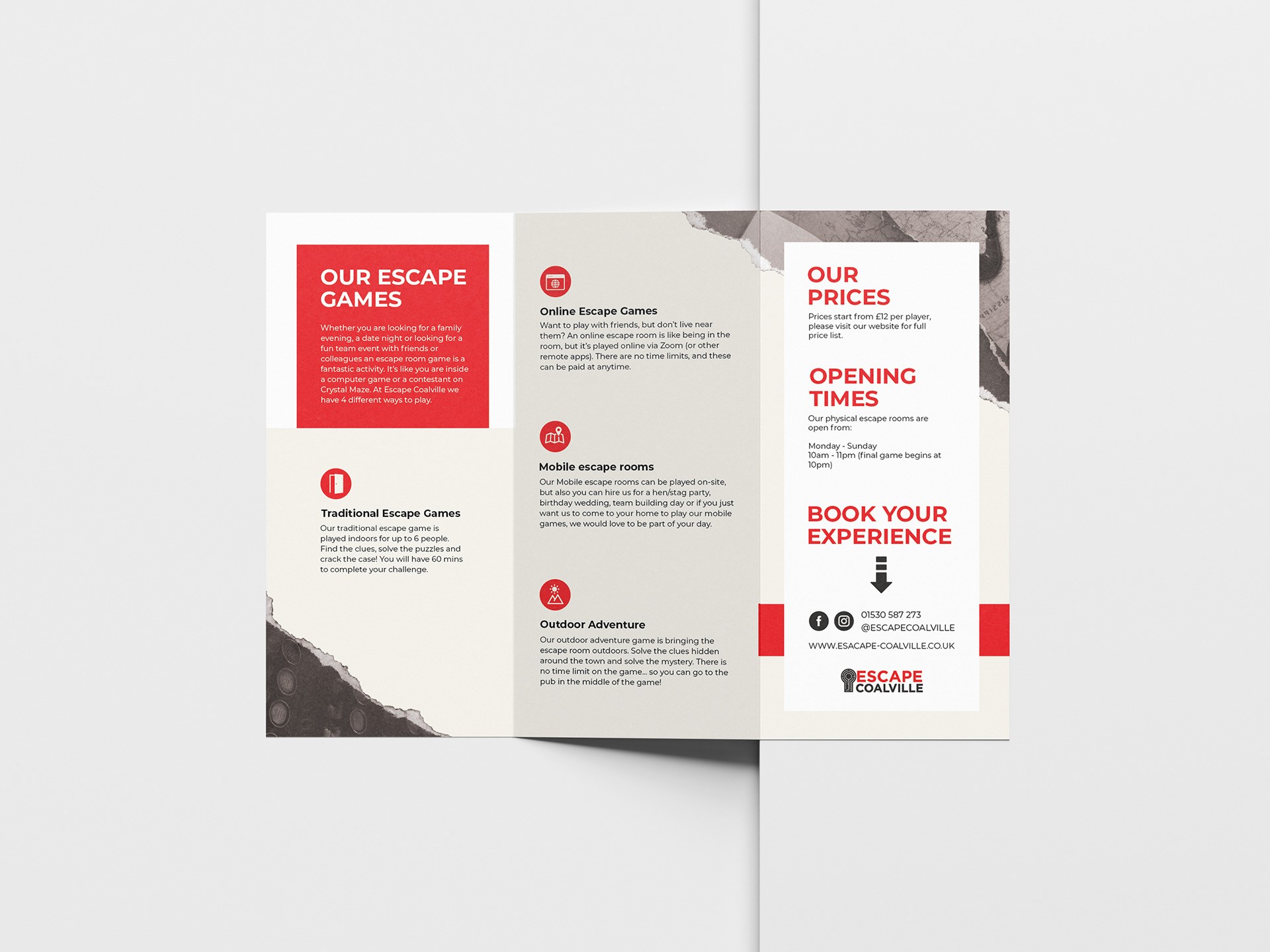
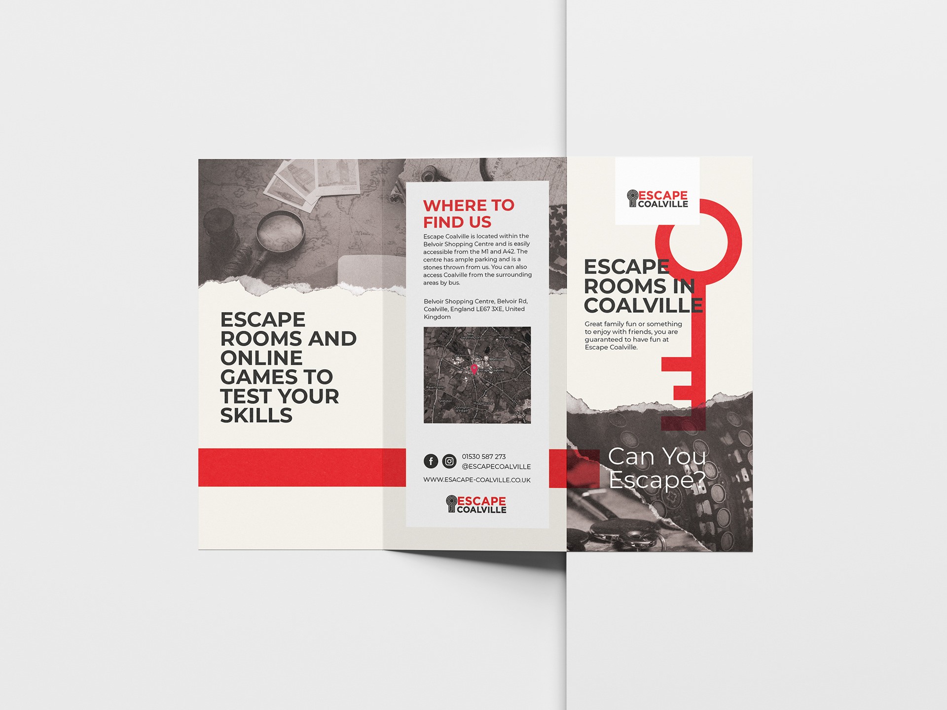
A local escape room business approached me to create a promotional flyer that would effectively communicate their offerings in a professional yet intriguing way. The key challenge was to design a simple but engaging visual that would captivate potential customers, encouraging them to explore what the business has to offer.
Client
Escape Coalville
Services
Broshure Design
Industries
Entertainment
Date
Feb 2023
In developing the flyer, I focused on creating a layout that was clean yet dynamic. To reflect the mystery and problem-solving aspect of escape rooms, I incorporated elements like old photography and paper textures. These design choices subtly hint at the puzzle-like nature of the escape rooms, giving the flyer a feel of vintage clues or artifacts that one might encounter in an actual escape room. Additionally, I balanced the design with bold red accents to draw attention to the key sections, while ensuring the text was clear and easy to read. The goal was to make the flyer not just informational, but visually immersive, creating an experience for the viewer even before they step into the escape room.
Though this project was relatively straightforward, it highlights the importance of thoughtful design, even for something as simple as a flyer. By focusing on the details and aligning the visual aesthetics with the brand's identity, I was able to create a piece that not only informs but also engages and intrigues the audience. This project underscores the value of even small-scale design efforts in helping businesses elevate their brand and attract attention in competitive markets.


