All about consistancy
A logo that matches the company ethos
This project focused on creating a unique and meaningful logo for a consultancy brand whose tagline is "Consistency Breeds Accuracy." The company’s vision centered around the idea of consistency leading to precision in their work. With this concept in mind, the client requested a logo that featured either a looping arrow or a target. The logo had to be simple, effective, and versatile enough to be used across various brand touchpoints.
Client
GlobalFinance Inc.
Services
Logo Design Branding
Industries
Consultancy
Date
March 2022
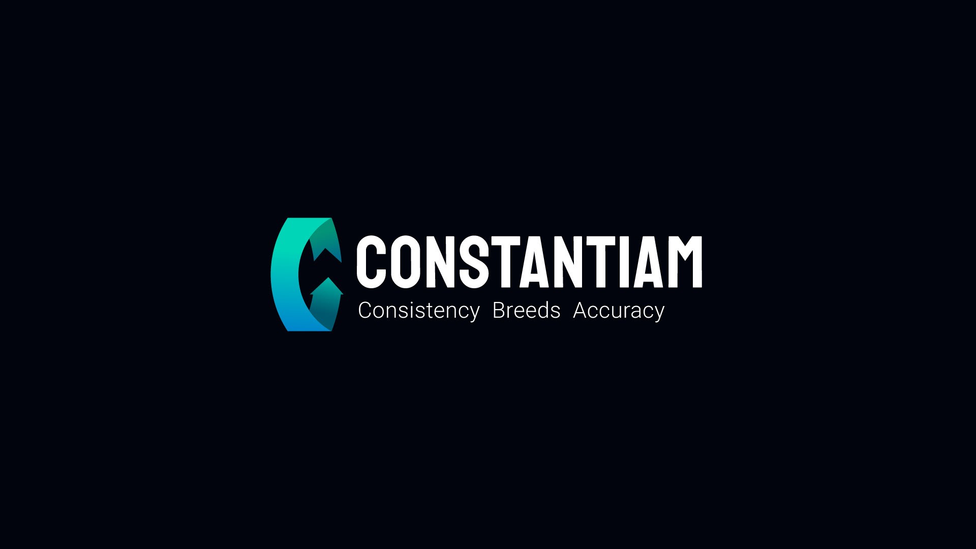
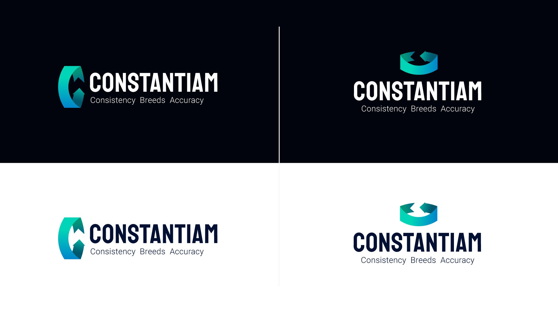
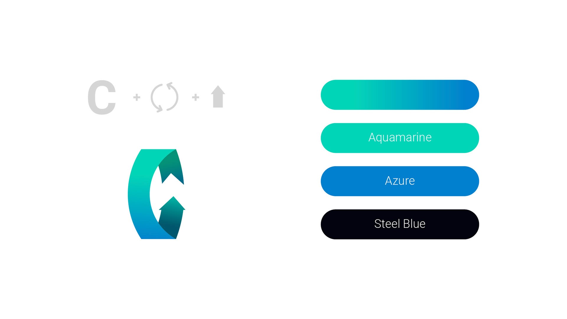
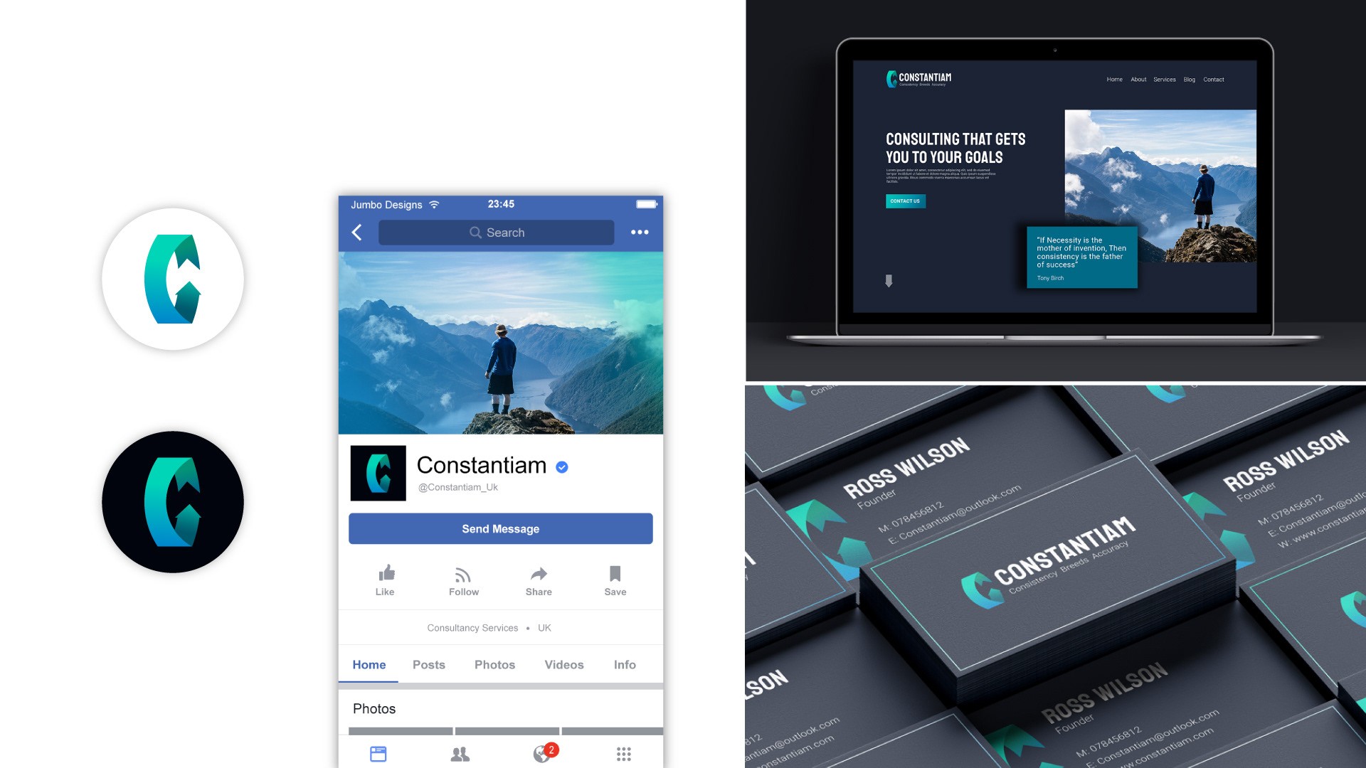
The final design cleverly incorporates an infinite looping arrow that forms the letter “C,” representing both the company’s name and its core value of consistency. This subtle yet impactful visual symbol conveys a sense of continuous progress and accuracy. The color scheme features a combination of cool blues and greens on a dark background, emphasizing trust, stability, and growth. The minimalist approach to the logo ensures that it remains versatile and timeless, with the arrow icon being able to stand alone as a powerful brand element across different mediums, such as websites, business cards, and marketing collateral.
This logo design successfully encapsulates the consultancy’s message of "Consistency Breeds Accuracy" through a simple yet clever visual symbol. By using the looping arrow to form the letter "C," the logo delivers both functionality and meaning.


