Whisky Label Design
Hand illustration mixed with modern design
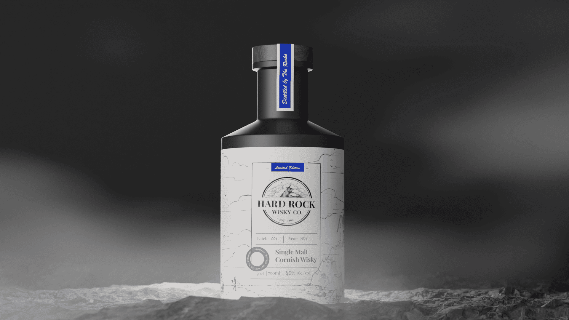
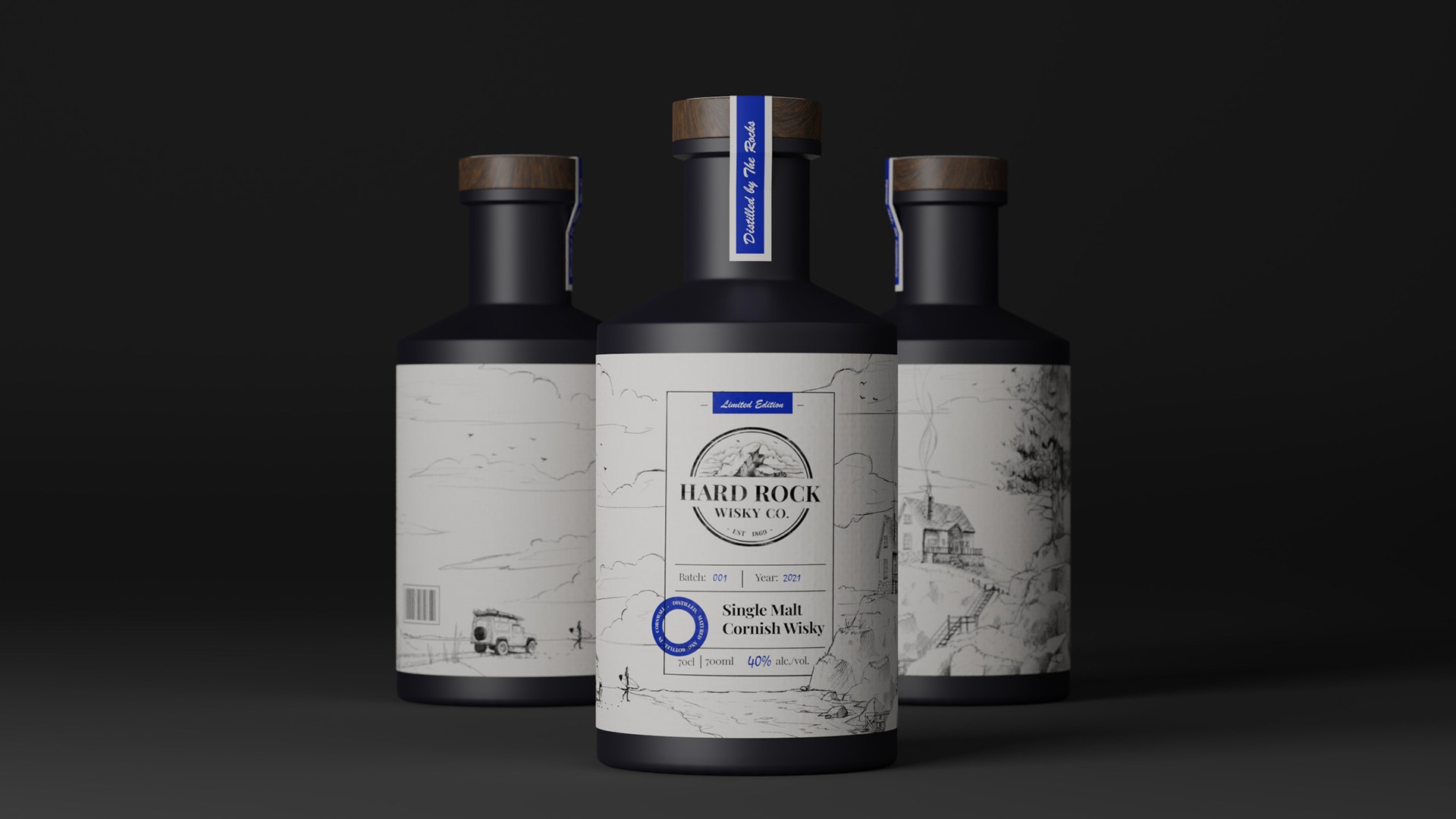
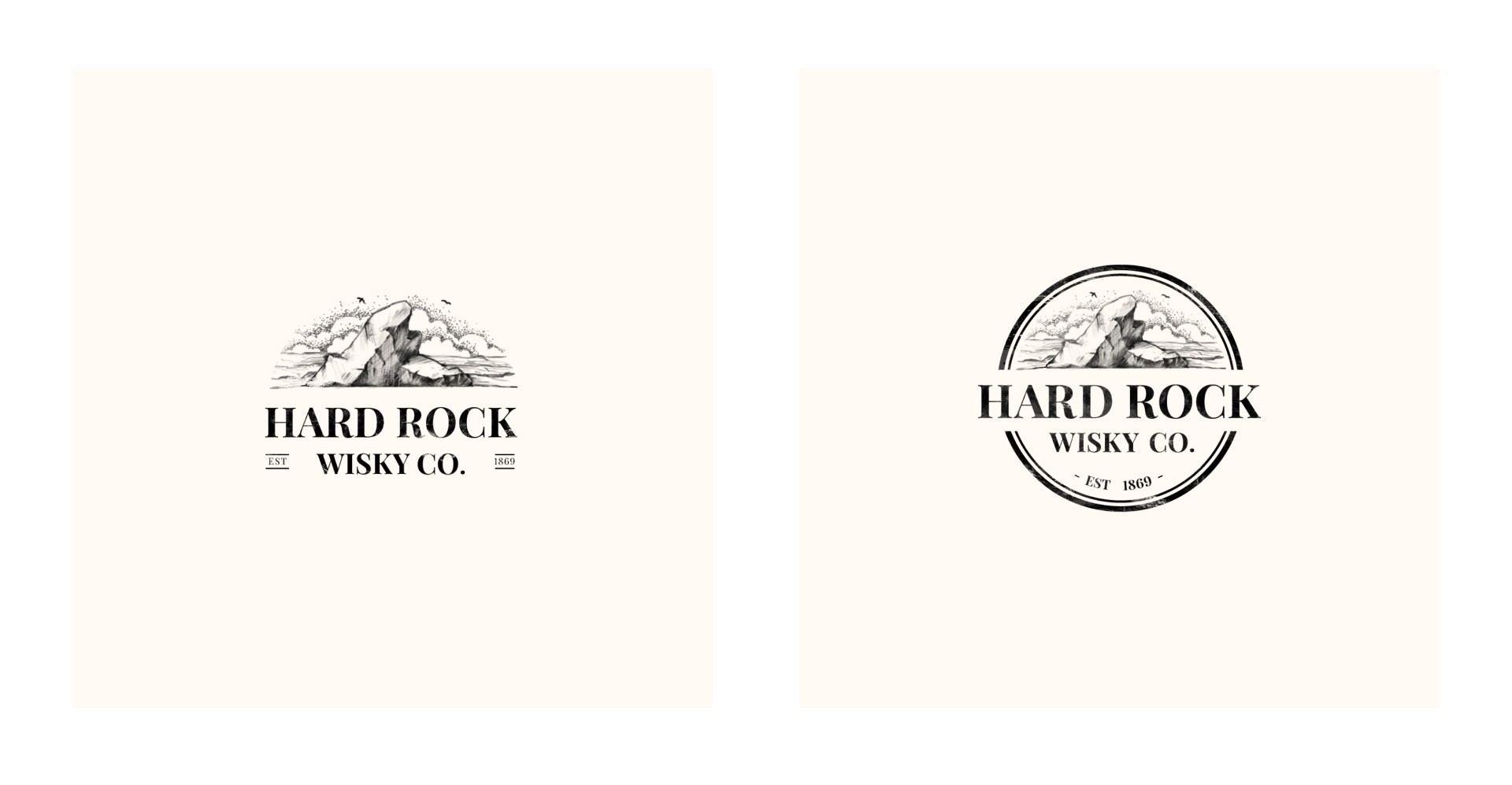
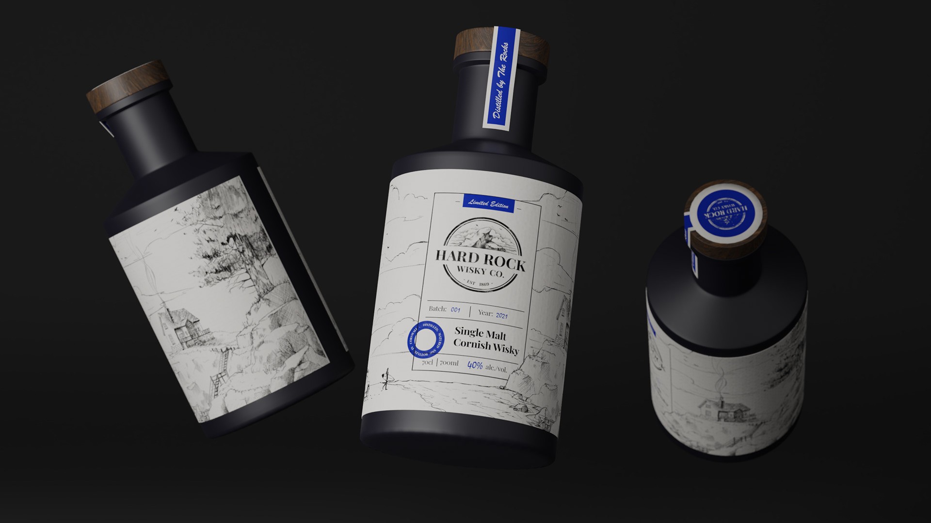
This concept project involved designing a modern yet elegant label for Hard Rock Whisky Co., a Cornish whisky brand seeking to bridge their rich history with contemporary appeal. The goal was to create a visual identity that felt handcrafted and traditional, reflecting the heritage of Cornish whisky, while also incorporating a sleek, modern aesthetic to attract today’s consumer. The label had to feel authentic and artisan, evoking a sense of place and history through its design elements.
Client
Hard Rock Whisky
Services
Label Design Illustration
Industries
Retail
Date
January 2023
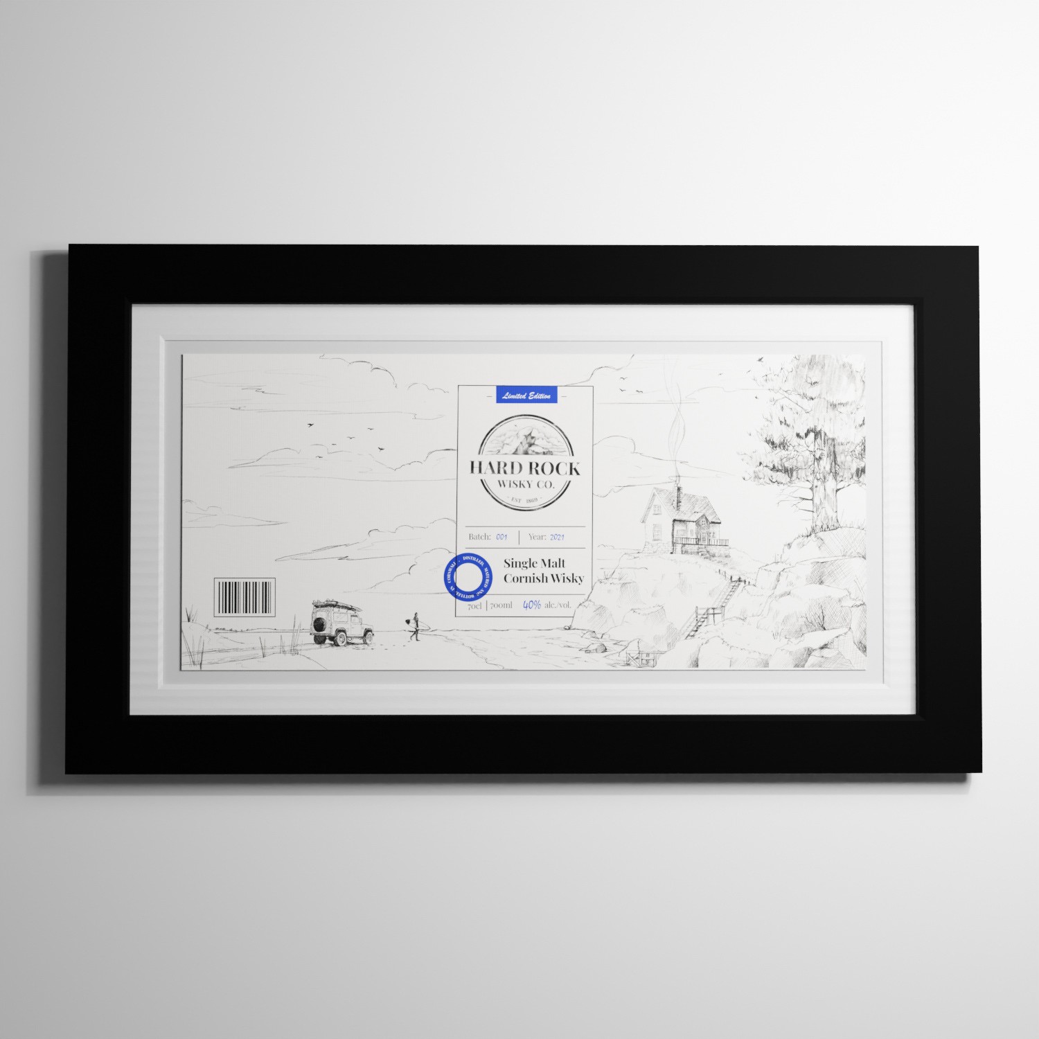
The centerpiece of the design is a detailed, hand-drawn illustration of a coastal scene, which embodies the essence of the Cornish landscape. This sketch, etched with fine lines, adds a rustic, handcrafted touch to the bottle, evoking a sense of tradition and craftsmanship. To balance this traditional feel, the overall layout maintains a minimalist, modern style with clean typography and sharp blue accents. The bottle itself, with its matte black finish and wooden cap, complements the label’s artisanal look while ensuring it appeals to a modern audience. The fusion of old-world charm and modern elegance results in a design that captures the brand’s identity and story.
This project demonstrates how a well-crafted label can effectively convey a brand’s heritage while remaining relevant in a modern marketplace. By focusing on both the visual storytelling of the Cornish coast and maintaining a sleek, contemporary layout, I was able to deliver a design that resonated with the whisky brand’s vision.
